@cbcreativestudios
#7 Best Practices for an Effective Contact Us Page Design
This post is all about a Contact Us Page.

Your Contact Us page is essentially your business’s closing statement—it’s your chance to show potential clients why they should reach out to you.
Let’s face it: a basic contact form alone isn’t enough. To truly make an impact and encourage people to get in touch, your contact page needs to be more than just functional. It should be inviting, easy to use, and engaging.
As a website designer, here are seven essential practices to include on your Contact Us page that you won’t want to miss.
Best Things to Include to Create an Effective Website Contact Page:
This post will walk you through the importance of your Contact Us page and outline my top 7 must-haves to make it truly effective.
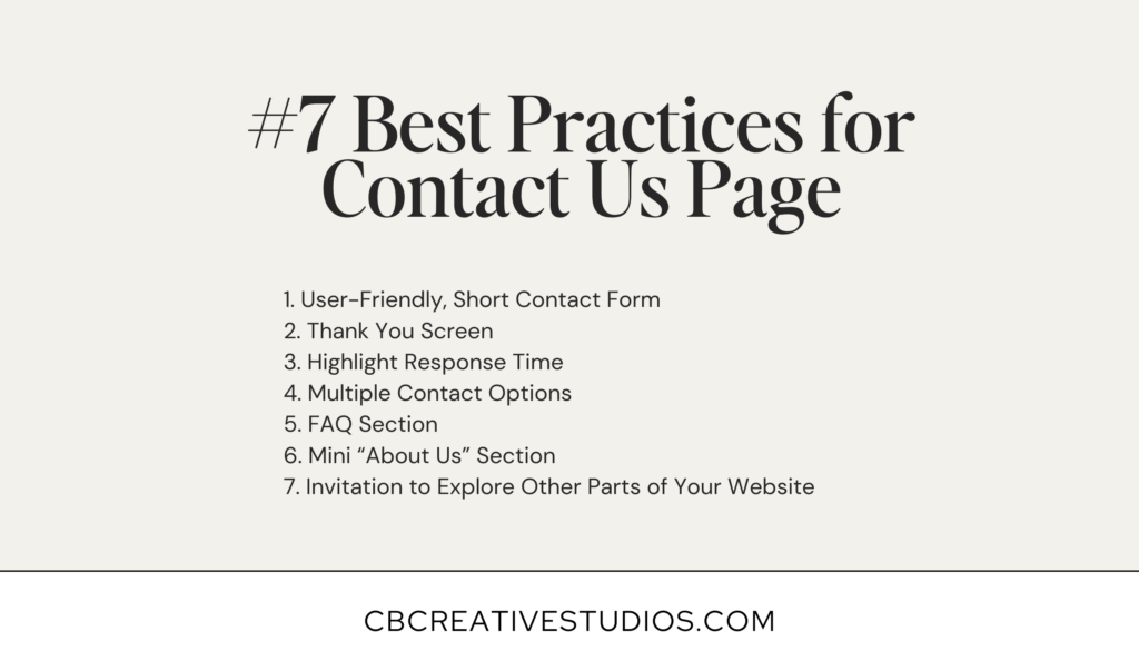
1. User-Friendly, Short Contact Form
A contact form is essential on your Contact Us page. It’s the primary way visitors can reach out to you, so it’s important to keep it simple and straightforward. Request only the basics: name, email address, and the reason for contact.
By keeping the form brief and focused, you make it easier for users to complete and submit. The simpler the form, the more likely you are to receive inquiries. Less is more—streamlining the process encourages more engagement and ensures effective communication.
2. Thank You Screen
After someone submits their form, it is important to make sure they know it went through successfully. A quick thank you screen is perfect for this. You might say something like, “Thanks for reaching out! I’ve got your message and will get back to you in 1-2 days. Keep an eye on your inbox!”
This lets visitors know you’ve received their message and gives them a heads-up on when to expect a reply, making the whole process feel smooth and friendly.
3. Highlight Response Time
This is something many business owners overlook, but it’s super important! Let your visitors know how soon they can expect a reply. You might say, “We usually get back to you within 24-48 business hours.”
And make sure you stick to that promise! Being clear about response times helps set the right expectations and shows that you’re reliable and on top of things.
4. Multiple Contact Options
It’s always a good idea to offer more than one way for potential clients to reach you. Include an email address and phone number so people have options.
If your contact form happens to act up or if someone just prefers a different method, they’ll still have a way to get in touch. It’s all about making it as easy as possible for people to connect with you!

5. FAQ Section
Add an FAQ section to your Contact Us page to tackle common questions right off the bat.
This can help answer queries before they even reach you and cut down on repetitive inquiries. It’s a great way to provide quick answers and save both you and your visitors some time.
6. Mini “About Us” Section
Include a brief introduction to your business on the Contact Us page. A quick “About Us” section helps visitors understand who you are and what you do, adding a personal touch.
It can make your business feel more approachable and trustworthy, giving potential clients a bit more context before they reach out.
7. Invitation to Explore Other Parts of Your Website
Invite visitors to explore more of your site while they’re here. Suggest they check out your blog, services, or portfolio to learn more about what you offer.
It’s a great way to keep them engaged and give them more reasons to connect with you!
So to recap…
Designing your Contact Us page does not have be overwhelming, stick to these #7 tips…

That is it friends! I hope you have enjoyed this post and have snagged some new ideas for creating your Contact Us Page.
Need help creating or updating your website?
I understand this is a lot to process, which is why I specialize in custom website design and am eager to assist you with redesigning your website. My clients not only stand out online but also elevate their pricing, attract high-quality leads, and book clients they genuinely enjoy working with.
Want to try out Showit’s drag and drop website builder for free before you commit? CB Creative Studios can offer you a free month with Showit on top of their free trial. You can get your first month free right here.

whats trending
#5 Essential Things to Include in your Website About Page
#7 Reasons to Choose Showit Website Builder for Your Business
#7 Best Practices for an Effective Contact Us Page Design
Having an unstoppable mindset is my #1 business tactic. As a Professional Showit Website Designer, I specialize in guiding clients back to their core strengths.
a note from cass
Follow along
Custom Showit
Web Design
my services
I'M CASS
Custom
Graphic Design
my services
work with us
hi there!
Leave a Reply
I'm Cassidy, a seasoned graphic designer and ShowIt website specialist catering to creatives. Click here to learn more about me!
a note from cass
Follow along
Hi, I'm Cass
I'm Cassidy, a seasoned graphic designer and ShowIt website specialist catering to creatives. Click here to learn more about me!

Leave a Comment
Leave a Comment